ZipPitch: the Speed-Dating app for Angel Investing
The Democratization of the Crowdsourced Investing Environment
ZipPitch is an app that matches investing interests with companies quickly and incorporates tools that apply “Shark Tank” questions and help educate investors with a focus on their risk tolerance.
Client
A project to bring consumers into the crowd-sourced funding for start-ups and help educate them in the challenges and opportunities in angel investing.
Team: Myself, Colin Robins & Cheslie Martin
I was responsible for the Presentation intro, Product design from research to conception, visualization and testing
Project Time
3 months
Challenges
ZipPitch faces several challenges in its mission to bring consumers into the crowd-sourced funding for start-ups and educate them about the challenges and opportunities in angel investing.
- Complexity and risk: Consumers lack knowledge, leading to potential financial losses.
- Lack of regulatory oversight: Challenges in verifying legitimacy of start-ups.
- Convincing consumers: Preference for traditional, secure investments.
- Resource-intensive education: Requires significant expertise and resources.
Actions
To address the challenges faced by ZipPitch in bringing consumers into crowd-sourced funding and educating them about angel investing, several actions were taken.
Firstly, a comprehensive educational program was included in development to bridge the knowledge gap and empower consumers to make informed investment decisions. This program included the incorporation of the parameters used by the popular TV show Shark Tank for evaluating new businesses. These parameters, such as market potential, scalability, competitive advantage, and financial projections, can serve as valuable guidelines for investors to assess start-up opportunities. By familiarizing consumers with these evaluation criteria, ZipPitch can enhance their understanding of what makes a promising investment opportunity and help them make more informed investment decisions.
Secondly, stringent oversight measures were to be implemented within the crowdfunding space to protect investors. Our approach was to involve adopting a fund rating system similar to Morningstar’s rating system used in the traditional investment industry. This system assesses the performance, risk, and other factors of mutual funds to provide investors with reliable information for decision-making. By implementing a similar rating system for start-ups seeking funding on the ZipPitch platform, investors can have access to transparent and standardized information, enabling them to evaluate the potential risks and rewards associated with investing in a particular venture.
ZipPitch can enhance investor protection, improve decision-making, and foster a more reliable and trustworthy environment for crowd-sourced funding. These measures will not only help consumers understand the intricacies of angel investing but also empower them to make well-informed investment choices while minimizing potential risks.
Competitive Analysis
I focused on the top 3 competitors; Venn-Cat, Let’s Venture and Our Crowd. The first two were limited in helpfulness as the apps kept you from searching until you had signed up with your banking information which we didn’t want to commit to and decided not to adopt ourselves.
The Our Crowd app allowed for searching for investments immediately, which we liked and so became our primary competitor. While it gave good overall initial information, it was presented for Angel Investors who knew the lingo and that limited its target market dramatically.

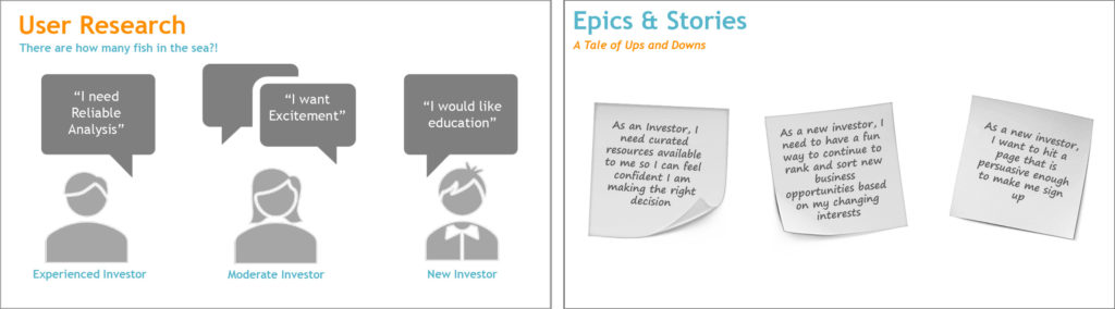
User Research
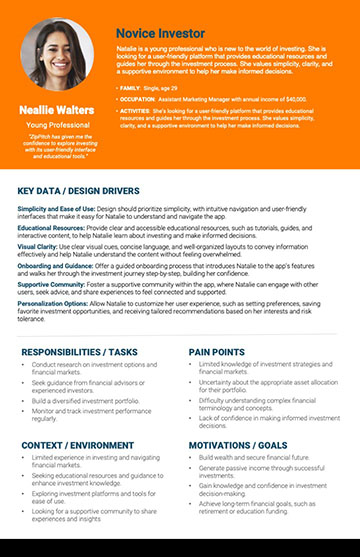
- “As an Investor, I need curated resources available to me so I can feel confident I am making the right decisions.”
- “As a new investor I need to have a fun way to continue to rank and sort new business opportunities based on my changing interests.”
- “As a new investor, I want to hit a page that is persuasive enough to make me sign up.”
Findings from Interviews
- I want to invest in what I know/understand – following leaders like Warren Buffett, who only invest in areas they understand well.
- FOMO – so many tech companies are turning traditional services upside-down and creating extreme valuations like Amazon, Uber, AirBnb, etc…
- Investing terminology is complicated – the Shark Tank show makes it understandable.
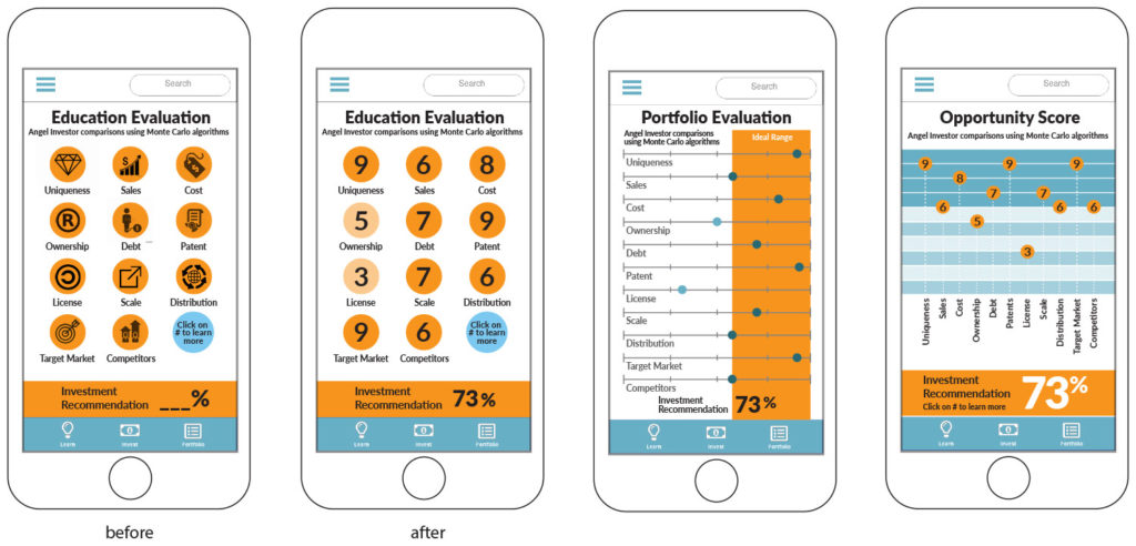
- I added the Monte Carlo method, a technique of statistical sampling employed to approximate solutions to quantitative problems. This process is used for the retirement advisement industry and it dovetail with a way to confidently display complex information visually and confidently.
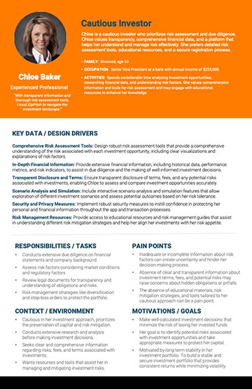
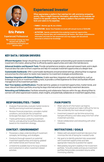
Personas
We looked for a variety of users, from the experienced investor to the novice, to find differences and commonalities in our audience.
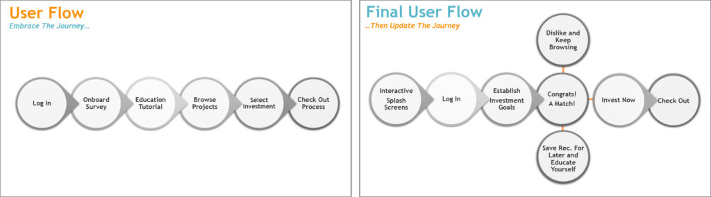
User Flow
In order to visualize and make more tangible the individual steps that a user makes during the course and its possibilities, we created a corresponding model.
This model was revised when we found that our on-boarding and education experiences took so much time on the front end that our User’s lost interest. We moved the formalized on-boarding to later and the education element as an opt-in so that our User’s could really enjoy the search for investing opportunities quickly and then engage those elements when they had need to.
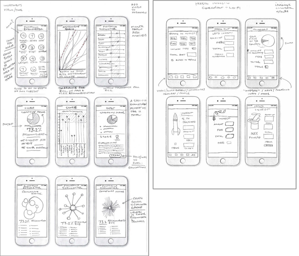
Sketching
My team members worked on the basic page layouts for the introduction and log-in. I focused on the data visualization elements of our ideas. My sketches focused on taking the main evaluation sections and creating many options for visualizing the data for the ‘analysis / recommendation’ screens.
It was important to me to have many options to be reviewed for the investment evaluation and checkout pages which were essential parts of our app.
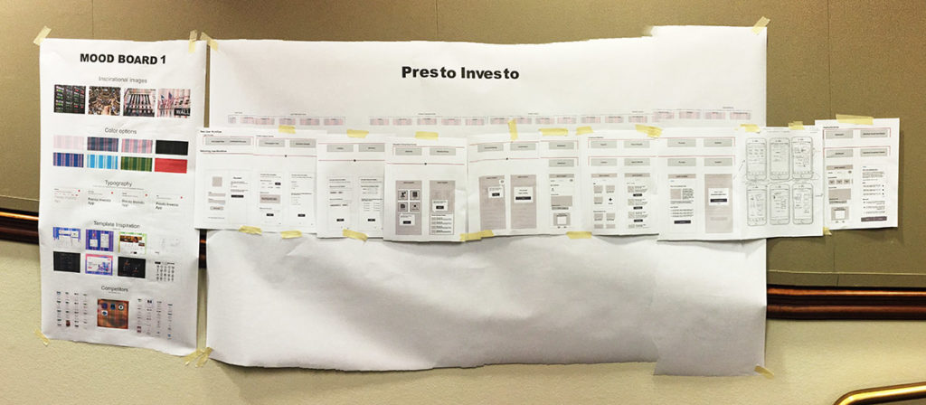
Building Assets
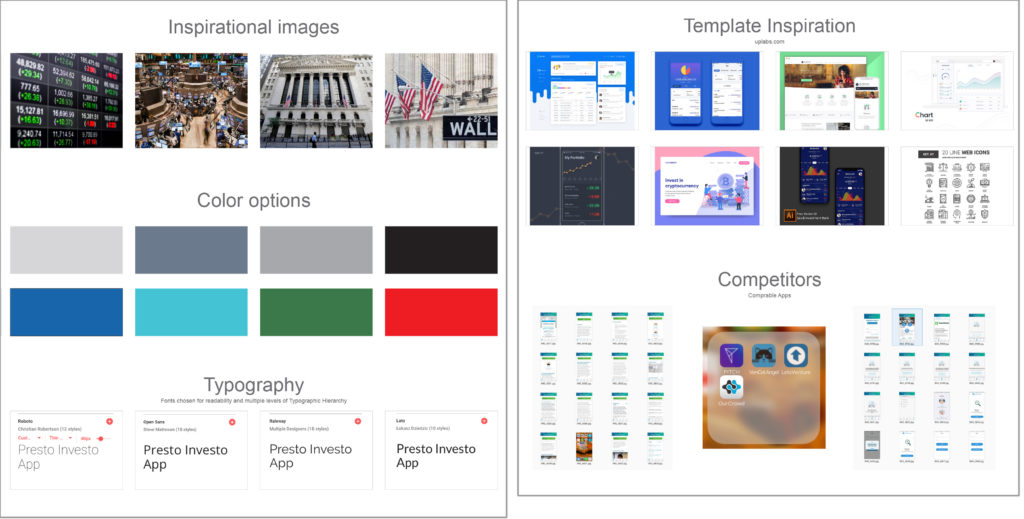
Moodboards and competitive analysis helped us start the process of visualizing our app and this was one of my areas as I enjoy trying to figure out the path our designs might take. By reviewing our competitors we understood where others had gone and the possibilities in serving areas where they hadn’t.
Our colors and type came from established resources and initial assumptions about our audience to help speed up our design process.
Knowing we could evolve these beginning assumptions through updated CSS / style sheets later enabled us to start the initial visualization process without too much hand-wringing over the ideal design solution.
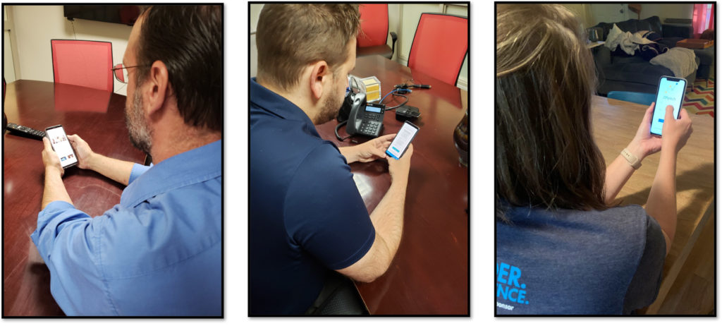
Usability Testing
After some paper prototyping adjustments, wireframes, mid- and high fidelity prototypes were created, which were supplemented with clickability using Adobe XD. Again, user tests revealed small vulnerabilities in the structure of the user interface, in some interactions.
Digital Design Sketches
After some paper prototyping adjustments, wireframes, mid- and high fidelity prototypes were created, which were supplemented with clickability using Adobe XD.
Again, my designs and focus were on data visualization, trying to help the user best see their new opportunities for investing.
More Explorations
The Illustrator renderings above were converted into Adobe XD below with additional data being added to again show options for our Users to evaluate.

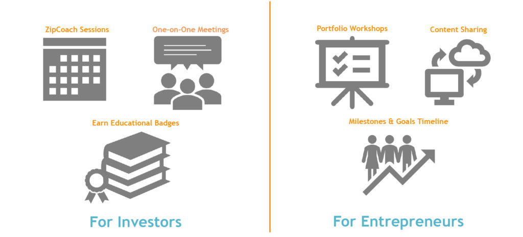
Future Features
Many ideas that seemed to resonate with our audience were discussed for future consideration.
Conclusion
AI could revolutionize and democratize the investment sector. Not for the sake of AI, but because, as the need for unbiased investment review. Just like MorningStar’s fund rating system visualized company data and helped investor’s picks with their side-by-side comparisons, our ability to visualize and filter risk could help this sector grow with investment from small investors rather than just large.
Due to the complexity of the project we were not able to implement any major adjustments to the concept in this short time. More testing with a larger audience would have helped us evaluate the strengths of the idea with more vigor.
We have an exciting way to combine existing elements like the Monte Carlo method and filtering to make investing in appropriate projects easy and accessible for the novice as well as the experienced investor. I approached the project with excitement for the research and ideation process. I wish I would have had more time to experience the user’s in our process. Overall I was happy with the way our small team split duties and accomplished so much in the prescribed time.
If there was more time available…
- Development of further user personas and Journey Maps / Task Models – in addition to the product-based Journey Map an experience-based Journey Map
- More research, as it‘s a complex and extensive topic with many factors where more practice would help us be better at facilitating an effective test as well as including stakeholders in them.
- Further iterations / test phases, actually test with real projects and their accompanying detail